
M
The brief
Mobile Physiotherapy has been serving the Western Suburbs of Perth for over 25 years. Despite the depth of experience, the visual identity hadn't kept pace. The rebrand needed to honour the history of the practice while signalling a fresh, professional chapter to new and existing clients.
My approach
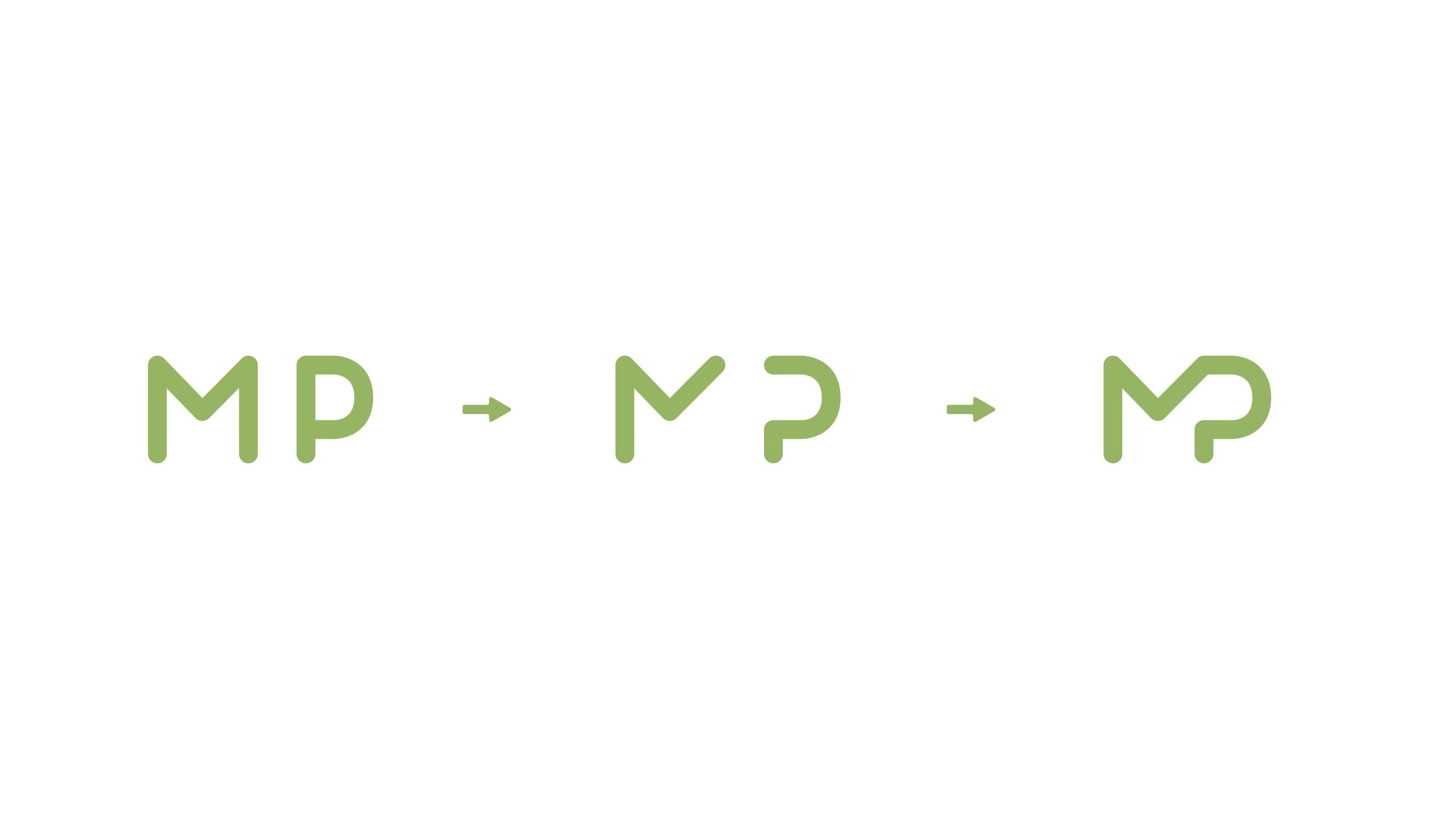
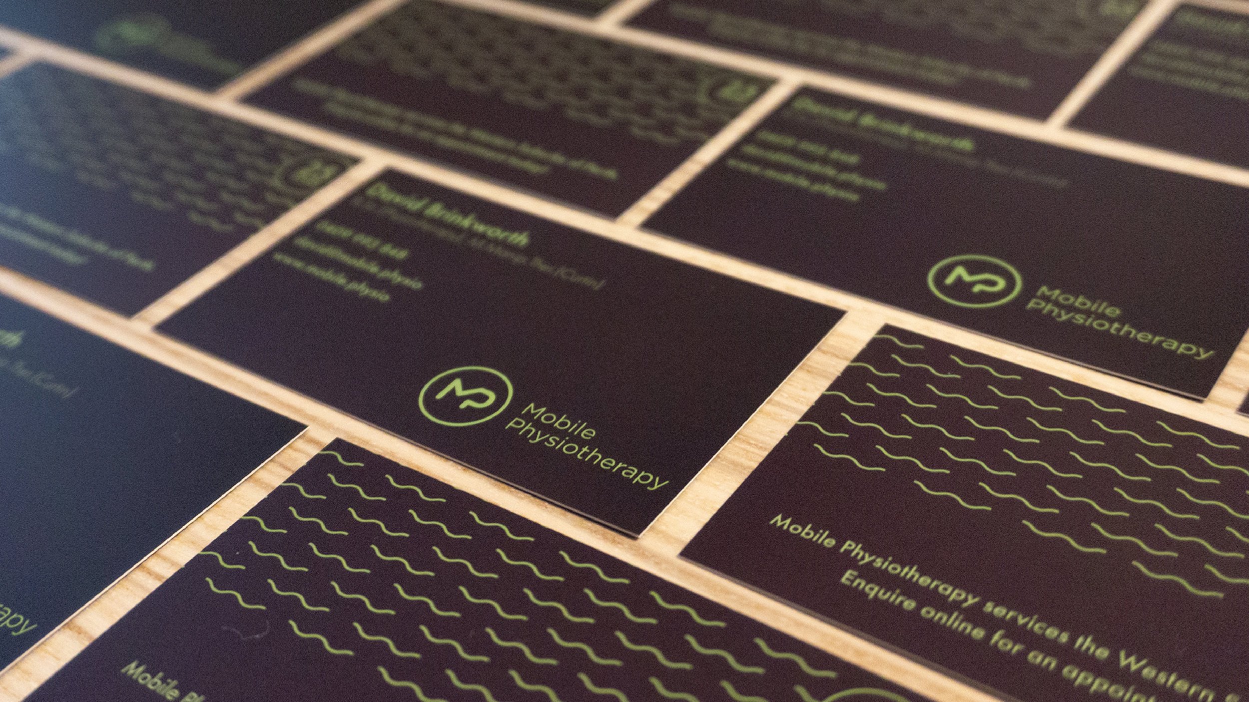
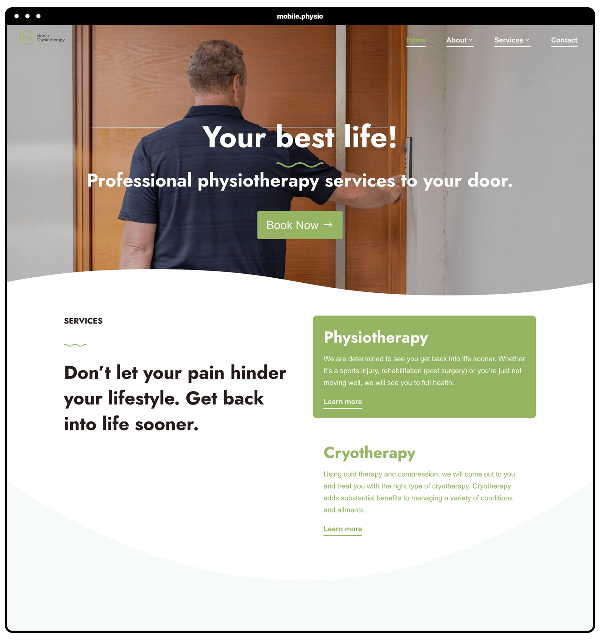
The logo design merges the M and P letterforms into a single flowing mark that symbolises continuity and the wholeness clients experience after treatment. The teal palette reinforces trust and care without feeling clinical. The full brand system extended into digital and print, giving the practice a consistent presence across every touchpoint.


Start your project
Ready to build