Perth Web Hosting has been looking after websites, email and domains for Western Australian businesses since 2006. Cameron Worts and his team answer their own phones, run their own servers in Perth and fix problems themselves. That's rare in hosting, and the brand wasn't saying it.
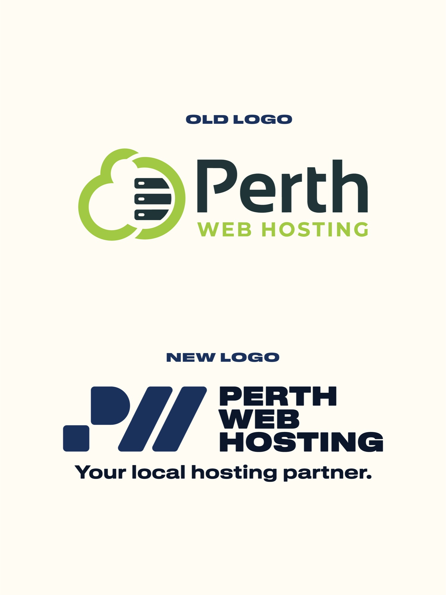
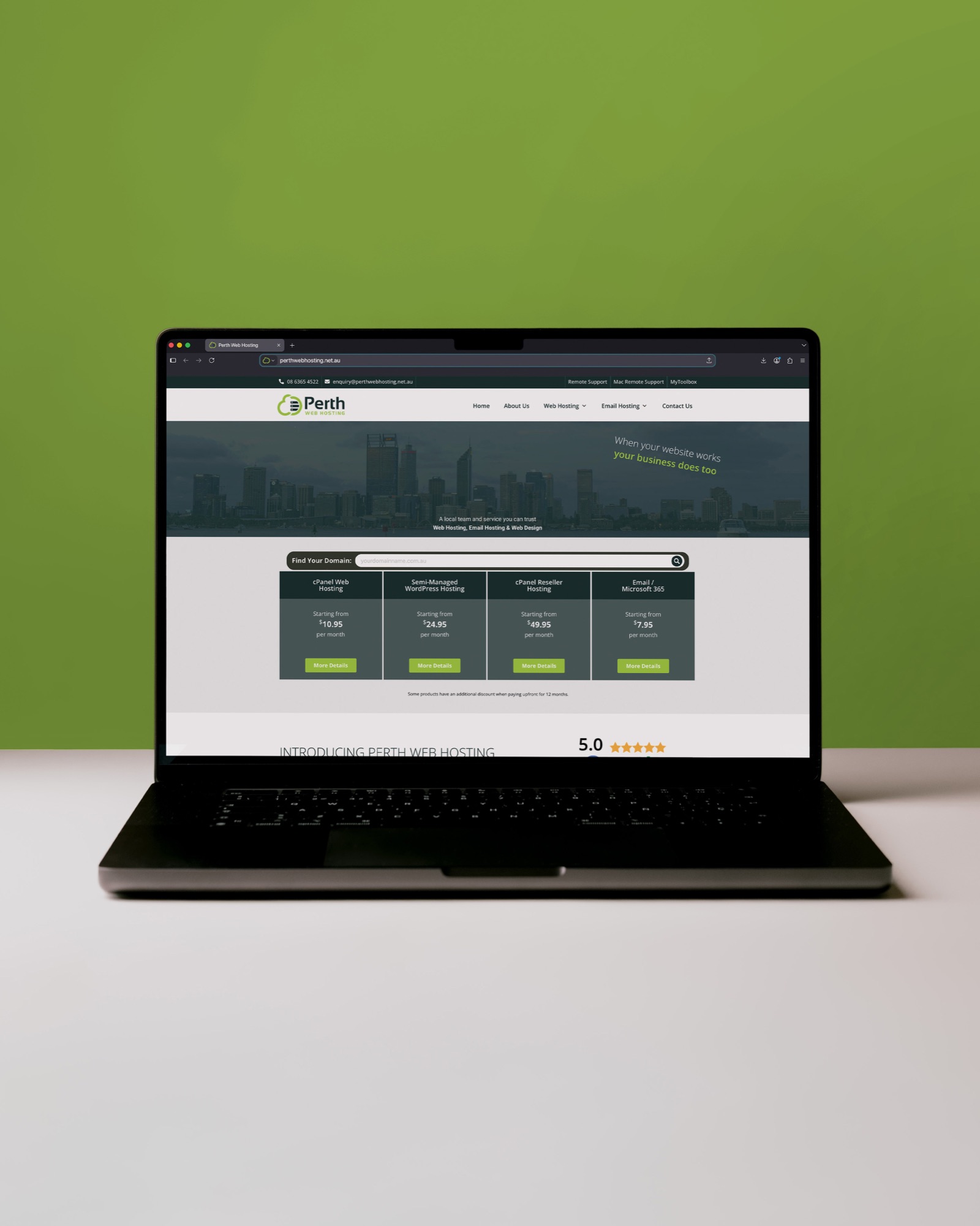
The old logo was a green cloud and a server stack, the kind of idea you'd expect from almost any host. The website had the same problem. Domains had no page of their own, email sat on a page named after a technical term, and a service they'd stopped offering in 2023 was still in the main menu. After twenty years, the business had outgrown how it looked. The job was to make the brand match what customers got when they picked up the phone, a local hosting partner that becomes 'yours'.
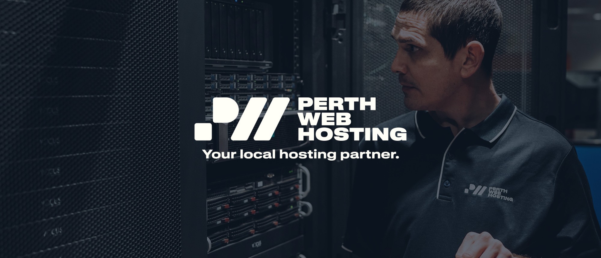
We ran the project through STORY, my process for building a brand from the strategy up. Before anything was designed, we got clear on who Perth Web Hosting is for, where it sits and how it should sound. It's for small business owners and tradies who need their website to work and someone to call when it doesn't. It isn't the cheapest option, and it isn't the enterprise one. It sounds like the reliable mate who happens to know a lot about tech. All of that comes down to one line: Your local hosting partner.
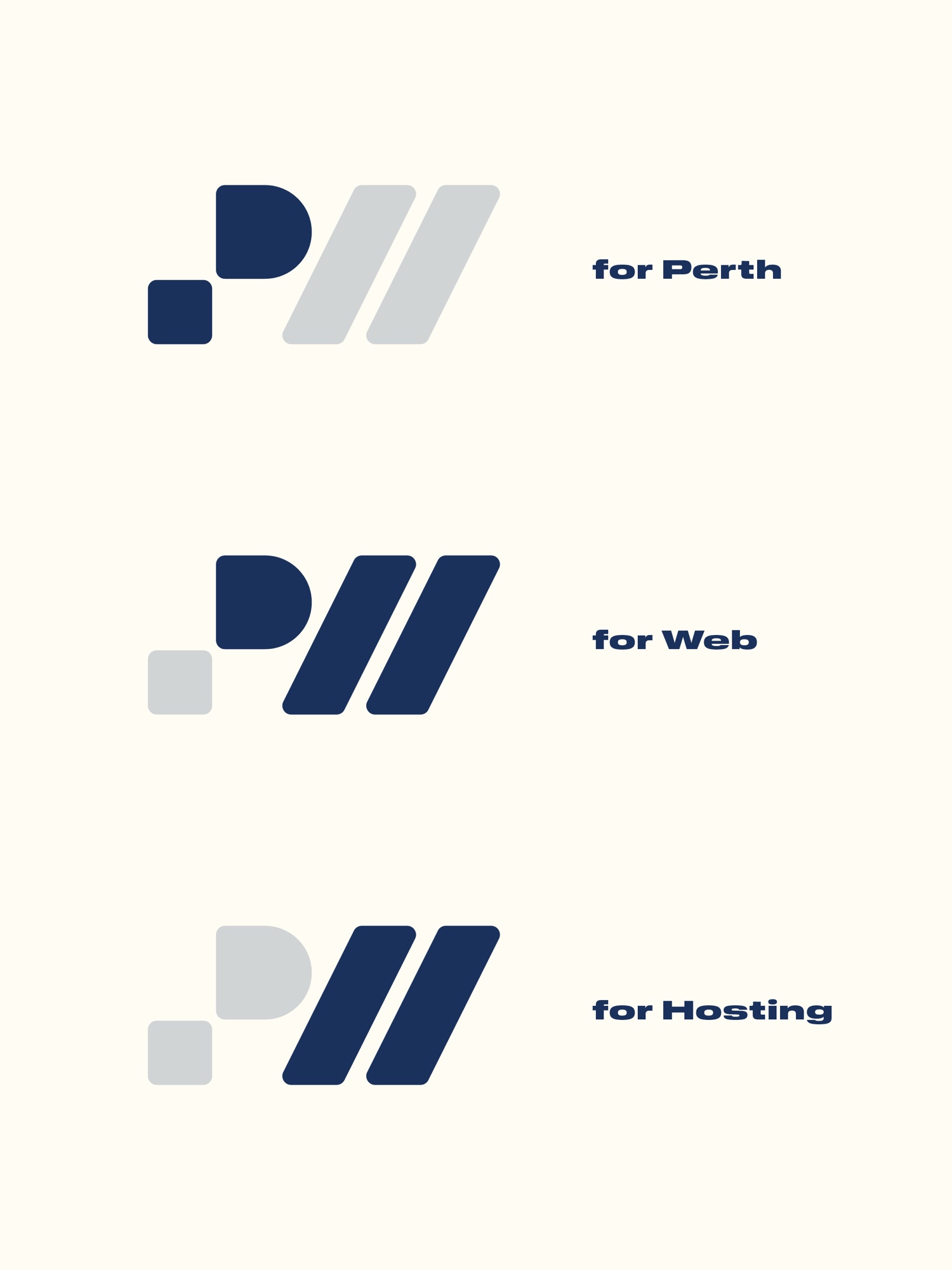
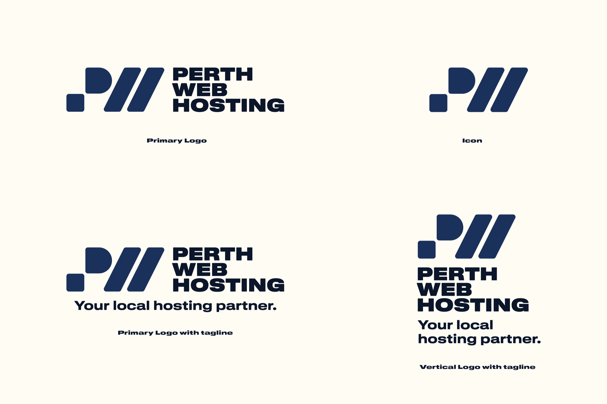
The logo came from there. It reads as a bold P, with a W and an H built into the same shape. The leaning strokes echo the :// in a web address, and the rounded corners keep something technical feeling human.
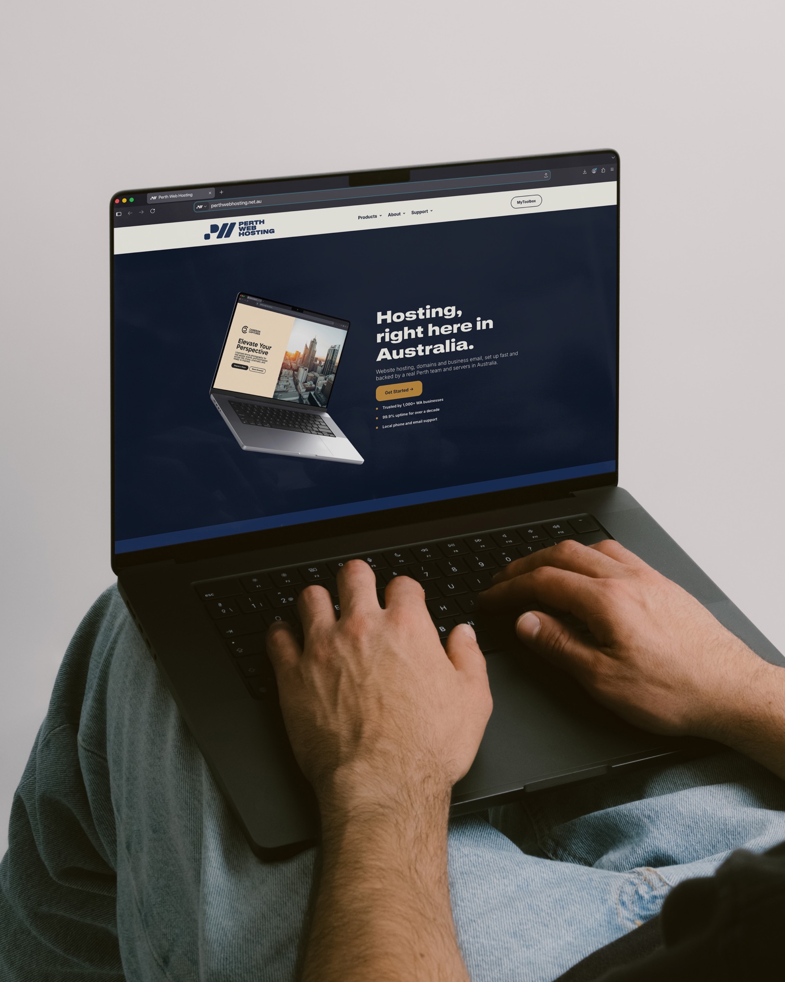
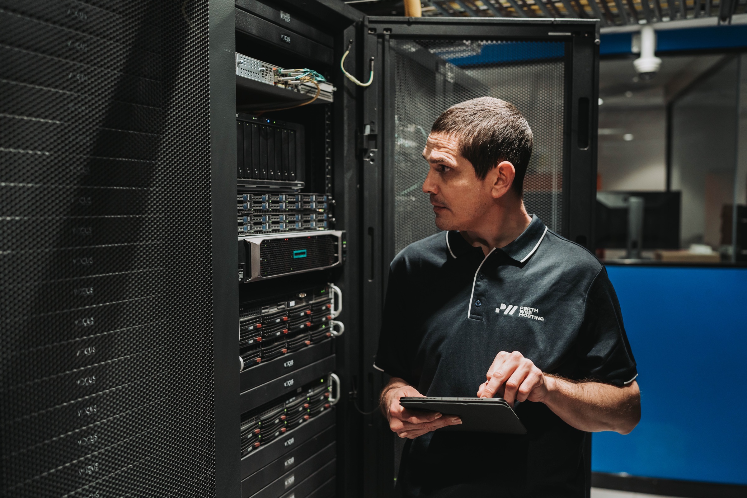
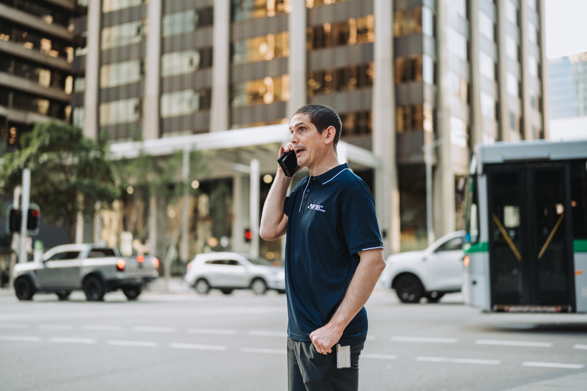
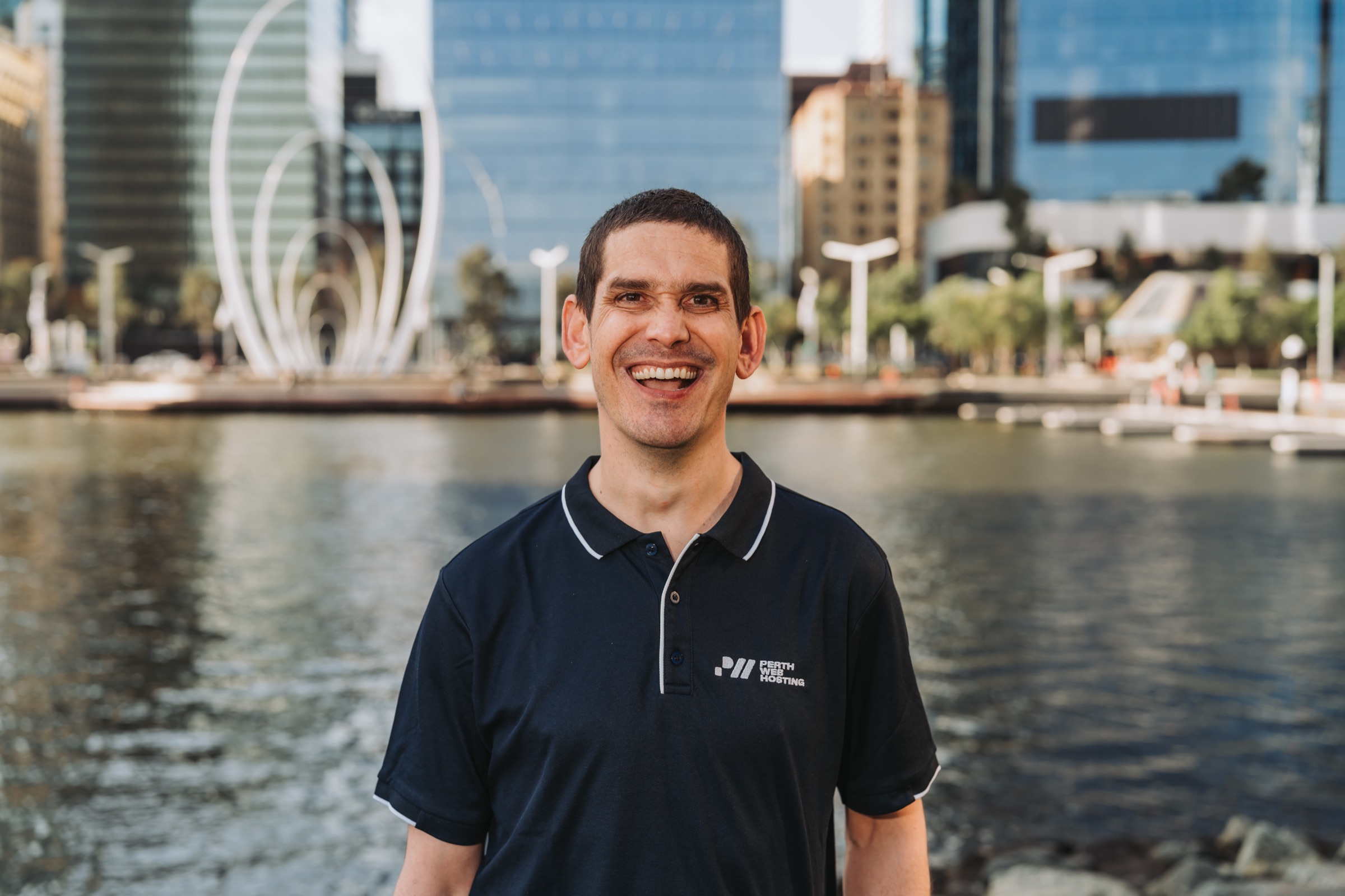
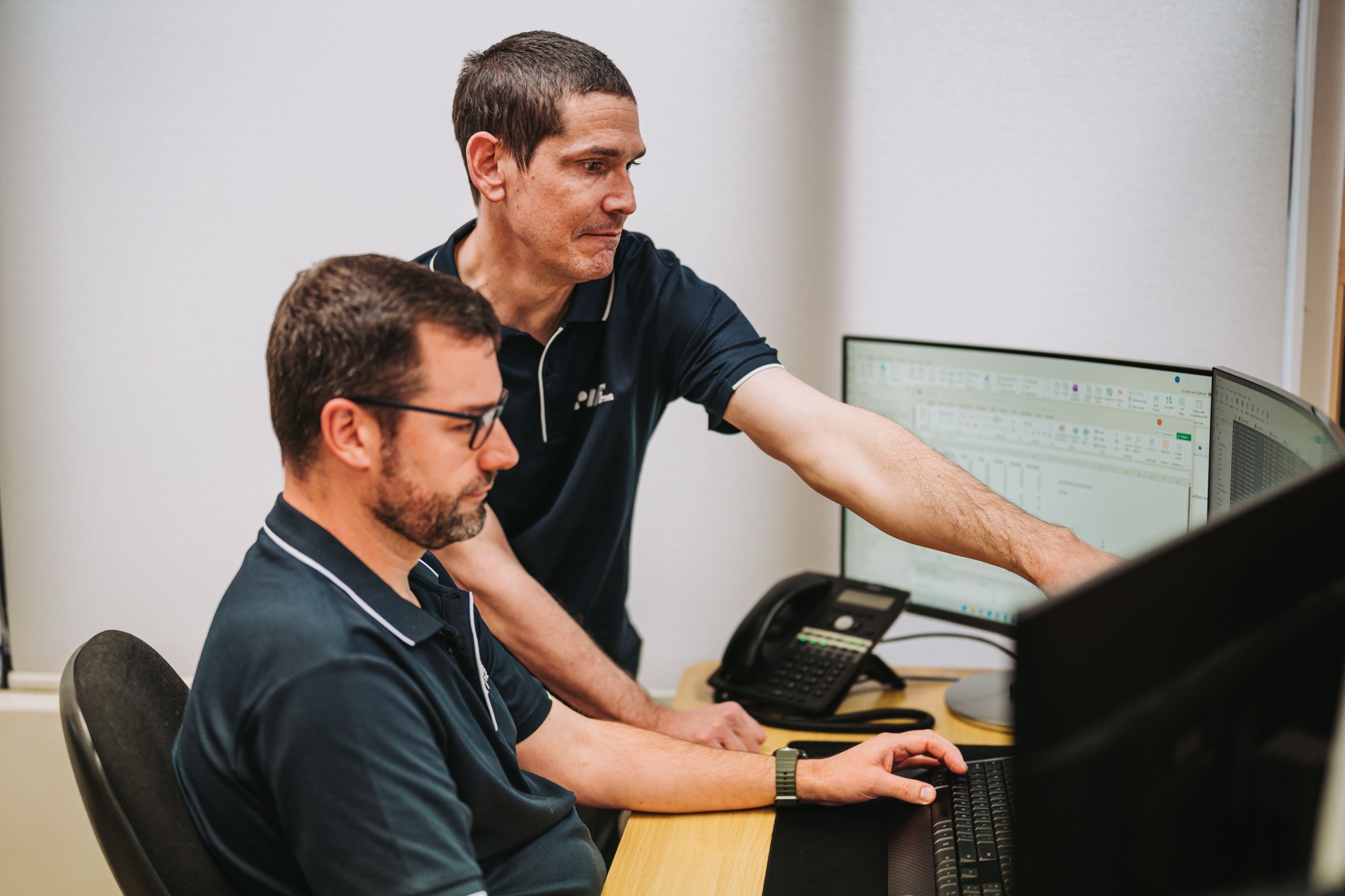
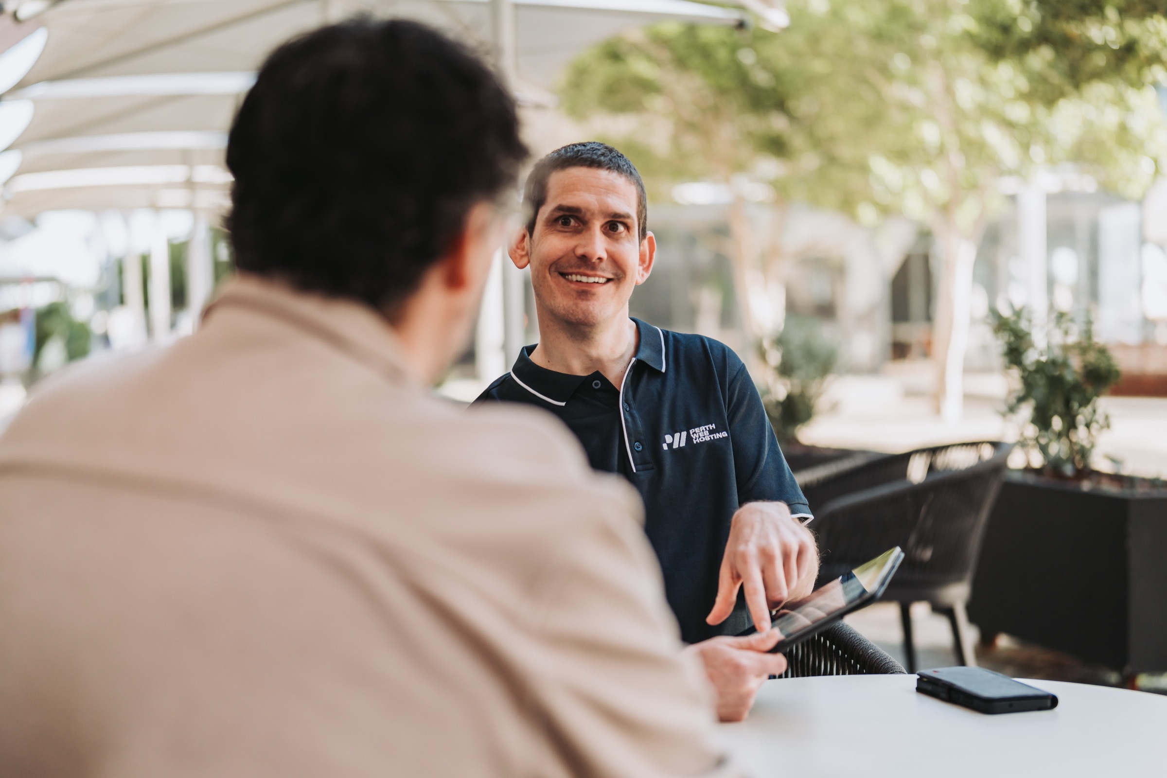
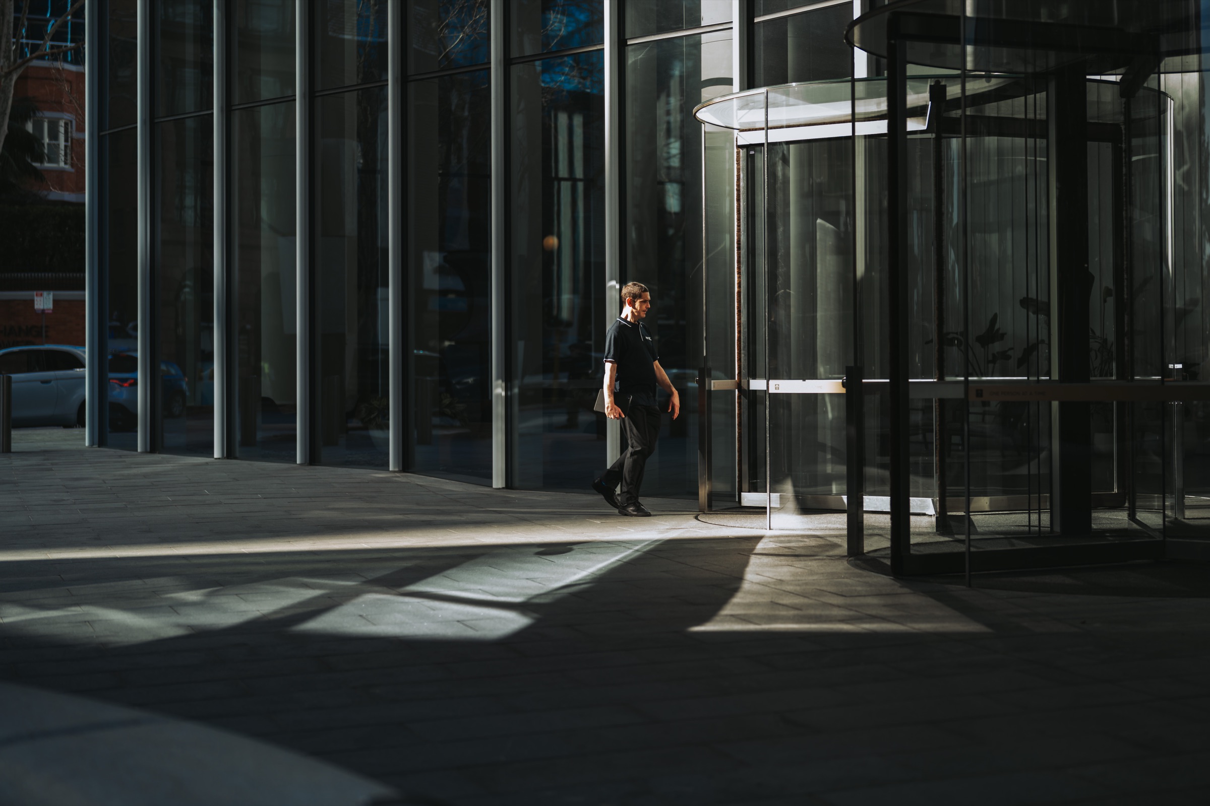
The website followed the same thinking. One of the biggest issues with hosting websites is that they talk in tech jargon, which leaves people with lots of questions, wondering what is what. I audited every page, then rebuilt the structure around what customers actually come looking for. Domains and email got proper pages, and anyone who doesn't know where to start can go through the walkthrough, which recommends what they need after some questions, or book a call to talk to one of the team in Perth. I wrote the copy in plain English and kept the addresses of pages already ranking in search. Then I photographed Cameron at work, in the office and in the data centre, because a business built on real local people should show them.
- A logo that reads as a P, with a W and an H built in and strokes that echo the :// of a web address
- Navy and cream with a touch of gold, replacing the old green cloud
- A copywriting guide and customer profile, so every email, support reply and web page sounds like the same business
- Website copy written so a busy tradie can understand it without an IT degree